101 liens privés
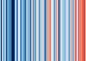
These ‘warming stripe’ graphics are visual representations of the change in temperature as measured in each country, region or city over the past 100+ years. Each stripe or bar represents the temperature in that country, region or city averaged over a year. The stripes typically start around the year 1900 and finish in 2025, but for many countries, regions and cities the stripes start in the 19th century or sometimes even the 18th century.


Ce rapport est la synthèse d’environ 34 000 papiers scientifiques. Les 269 autrices et auteurs principaux ont répondu à 62 418 commentaires des gouvernements et d’experts (!!!!). Le résumé à l’intention des décideurs a été validé ligne par ligne par les gouvernements, après deux semaines de délibération sur chaque phrase.